Introduction
Visual displays present information to users in various forms, including text, numbers, graphs, maps, diagrams, and pictures.1 Effectively designed visual displays allow users to extract important information and view and understand patterns in data to accomplish a specific goal. Visual displays are not always safety-critical, but in high-risk industries like healthcare, automotive, aviation, and nuclear, visual displays play a central role in data comprehension, reasoning, communication, and decision-making.2,3
Health information technologies (health IT), specifically electronic health records (EHRs), are used by most healthcare facilities in the United States and this technology relies on visual displays to communicate information to users. Health IT visual displays convey information such as patient identifiers, patient history, lab and imaging results, provider notes, medication information, and ancillary content like site policies and drug interaction data.4,5
An effective visual display helps providers accurately interpret patients’ health data, an essential aspect of providing quality care. Unfortunately, EHR visual displays have been suboptimal partially because of the amount, complexity, and diversity of information that needs to be represented.6 Studies have shown that the visibility of data, defined as where information is located and how it is presented, is a common problem in electronic medication administration records (eMARs) and computerized provider order entry (CPOE) systems.7–11 The consequences of poor visual display are profound. When visual displays are ineffectively designed, they can lead to clinician burnout,12–15 diagnostic error,5,16,17 and even patient harm.7,11,18
Human factors is a scientific discipline that aims to understand human capabilities to design work environments that meet these capabilities and enable optimal human performance.1 From a human factors perspective, designing an effective visual display requires considering the purpose of the visual display and the information that needs to be conveyed through the display, as well as the strengths and limitations of human perception. For example, we can perceive a limited portion of the light spectrum (i.e., 380 to 700 nanometers) and cannot see information in the visual display if it is below human detectability levels. Nevertheless, our perception allows us to find patterns and identify meaning in the abstract (e.g., we connect red with the meaning “stop” and “emergency”).19 These features of human perception, both the ways it hinders and helps us interpret the world, can be understood and leveraged to make effective visual displays.
Many high-risk industries other than healthcare have historically incorporated human factors into their visual display designs by developing guidelines for optimal use. However, there are no required human factors guidelines or standards for the design of EHR visual displays. Consequently, EHR vendors and healthcare facilities may create and use design principles that may not adhere to human factors principles. There are EHR design recommendations from different agencies, including the National Institute of Standards and Technology (NIST). However, these are not required and often not adhered to.20
In this study, we sought to identify visual display guidelines used in the automotive, aviation, and nuclear industries to inform healthcare practices. If adopted in healthcare, these guidelines may address the plethora of visual display issues in EHR design and safety. Human factors and clinical experts reviewed the automotive, aviation, and nuclear industry guidelines to identify those most relevant to EHRs. Based on these guidelines, we provide considerations for visual display design in the EHR.
Methods
Previously described in Pruitt et al.,21 human factors guidelines documents endorsed by United States–based oversight agencies (e.g., Federal Aviation Administration) were identified for automotive, aviation, and nuclear industries. Two human factors experts evaluated the documents for inclusion based on the following four criteria: the publication must be endorsed by a federal government agency or be recognized by a federal government agency as applying to the industry for which the agency has oversight; be related to the automotive, aviation, or nuclear industry; contain principles, guidelines, and/or standards related to visual displays; and have been published after January 2012. Each reviewer independently evaluated each document to assess whether the document met inclusion criteria, and then each document was jointly discussed to ensure agreement. Through this process, we identified one comprehensive document from each industry for analysis in this study.22–24
A human factors expert extracted the title, date, agency, and specific discrete guidelines from each of the three industry documents included in the review and populated a Microsoft Excel spreadsheet. Guidelines were included if they contained information about the visual display, regardless of whether they were directly applicable to healthcare. Following extraction, two human factors experts and one clinical expert reviewed the guidelines to assess whether they were relevant to either inpatient or outpatient EHR design, including eMAR and CPOE, for frontline staff. Quality metrics in the EHR, such as sepsis rates for leadership or administration and demographics information, were not considered when determining relevance. Disagreements between experts were discussed until a consensus was reached. The guidelines that were relevant to healthcare were included in the full analysis.
The EHR-relevant guidelines were reviewed and grouped into meaningful topics. These topics were identified using a modified reflexive thematic analysis.25,26 Two human factors experts familiar with the data independently reviewed a subset of the relevant guidelines and assigned a label to each to represent the overall topic. Labels were discussed and collated to create an initial set of common topics that applied to the guidelines reviewed by all three industries. Using these inductively generated topics, the human factors experts independently classified the remaining guidelines, modifying topics as necessary and discussing discrepancies until a consensus was reached. Topics were reviewed for internal consistency and refined as necessary. The final topics and definitions can be found in Table 1.
Table 1.Visual Display Guideline Topics and Definitions.
| Topics |
Definitions |
|
|
| Alphanumeric |
Guidelines that describe how to visually display alpha (i.e., letters) and numeric (i.e., numbers) values |
| Color, Brightness, Contrast, and Luminance |
Guidelines that describe how to visually display color, brightness, contrast, and luminance |
| Comprehension |
Guidelines that describe how to visually display information to aid readability, legibility, and understanding of the information presented |
| Design Characteristics |
Guidelines that describe visual display design qualities and features that adhere to human factors principles (e.g., proximity, similarity, organization) |
Symbols, Pictograms,
and Icons |
Guidelines that describe how to visually display symbols, pictograms, and icons |
| Tables, Figures, Charts, and Lists |
Guidelines that describe how to visually display tables, figures, charts, and lists |
From the relevant guidelines under each topic, a clinical expert identified three guidelines per topic that were deemed to be the most relevant to the visual display of EHR design, considerations for healthcare, and examples.
Results
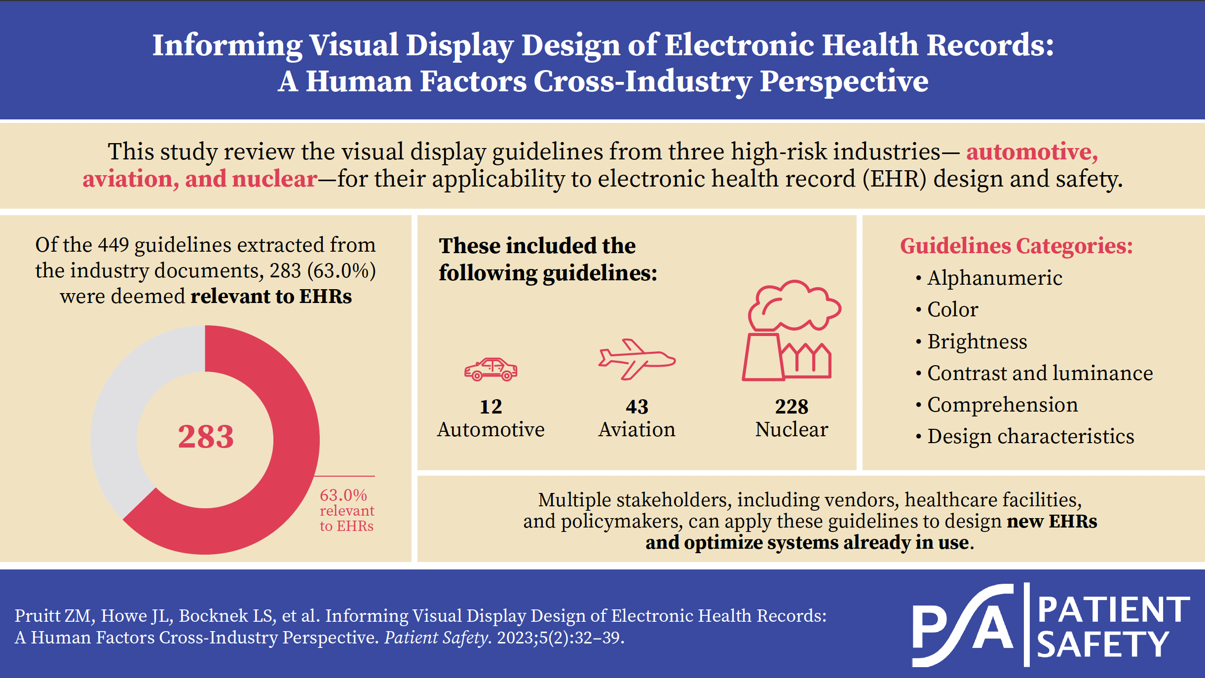
A total of 449 guidelines were extracted from the industry documents and 283 (63.0%) were deemed relevant to EHRs. By industry, 12 of 44 (27.3%) automotive industry guidelines were relevant, 43 of 115 (37.4%) aviation industry guidelines were relevant, and 228 of 290 (78.6%) nuclear industry guidelines were relevant. A comprehensive list of all the relevant guidelines can be found in Online Supplement Appendix A. Table 2 describes guidelines highly relevant and applicable to EHR design from other high-risk industries, considerations for EHRs, and examples per visual display guideline topic.
Table 2.Summary of the Guidelines Highly Relevant and Applicable to EHR Design From Other High-Risk Industries, Considerations for EHRs, and Examples per Visual Display Guideline Topic.
| Alphanumeric |
| Highly Relevant Guidelines From Other High-Risk Industries |
Considerations for EHRs |
Examples |
| For a given font, it should be possible to clearly distinguish between the following characters: X and K, T and Y, I and L, I and 1, O and Q, O and 0, S and 5, and U and V. |
It is important that clinicians can easily distinguish between different characters in the EHR to avoid misinterpreting displayed information (e.g., patient names, medication
names). Consequently, EHR information should be easily distinguishable. |
The EHR font should make it easier to distinguish between similar patient identifiers such as Aubrey and Audrey, Kay and Kat, Garrik and Garrix. |
| Leading zeros in numeric entries for whole numbers should be suppressed. For example, 28 should be displayed rather than 0028. A leading zero should be provided if the number is a decimal with no preceding integer (e.g., 0.43 rather than .43). |
If clinicians incorrectly read numbers in the EHR, they may make incorrect or unsafe decisions.
Leading zeros for decimals, and decimals only, can help clinicians distinguish between whole numbers and decimal values. |
EHRs should use leading zeros for decimals and not whole numbers. This will help clinicians read the information in the EHR and successfully order and administer medications, especially medications that can be given as decimals or whole numbers (e.g., 0.5 mg of morphine versus 5 mg of morphine). |
| Numeric displays should accommodate the parameter’s full range. The full range of the parameter includes highest and lowest values that the parameter is expected to take on, under any conditions (normal or emergency operations) for the tasks the display is designed to support. |
Clinicians work with multitudes of data types, from vitals to labs, with different range parameters. It is unreasonable for clinicians to remember the range parameters for each
condition. Consequently, displays must provide appropriate contextual information, such as the parameter’s full range. |
Pediatric medication dosing typically relies on the patient’s weight in relation to dosing ranges (e.g., give X dose if the patient is between Y and Z kg). It is important that the EHR clearly displays dosing ranges for a clinician’s entire patient demographic. |
| Color, Brightness, Contrast, and Luminance |
|
|
| Highly Relevant Guidelines From Other High-Risk Industries |
Considerations for EHRs |
Examples |
| The color is associated with the level of warning: red is normally associated with danger or critical situations, yellow is normally associated with caution, and green is normally associated with normal operation; however, other considerations about warning conspicuity may necessitate using a different color. |
Within hospitals and the EHR, colors are used to convey information. Sometimes the same color is used to indicate multiple, disparate types of information (e.g., green can represent normal lab values; pro re nata [PRN] medications; facility evacuations; or a specific healthcare team member, like medical assistants). Colors like red and green that have existing meanings outside of healthcare should be used in line with these existing meanings whenever possible. |
EHRs should exclusively use the color red for critical patient information, such as critical lab values or vitals. Red should not be used for any non-patient-related information (e.g., inability to sign an order, system error, or incorrect data entry). |
| Color coding should be redundant with some other display feature. Pertinent information should be available from some other cue in addition to color. Displayed data should provide necessary information even when viewed on a monochromatic display terminal or hardcopy printout, or when viewed by a user with color vision impairment. |
Color coding can be a helpful signal when designing an interface. However, users’ success at using the tool should not be predicated on their knowledge of the EHR’s color coding strategies or their biological ability to see color (i.e., color blindness). Thus, color codes should have redundant information, such as labels, to help users interpret the EHR’s visual display. |
In the CPOE, clinicians sometimes need to fill out additional fields before signing a medication order. Some EHRs highlight the required fields that must be filled in before signing to indicate that users need to input data. To ensure users understand that the EHR requires a field to be filled, a system should add a redundant signal, such as the word “REQUIRED,” to the field. |
| The quantity of colors used to code information is minimized; do not exceed four color codes. |
One major issue with EHR visual displays is the quantity of information the systems contain. Colors can help users sort through
information by helping focus attention on the most meaningful data (e.g., critical values, late medications, new orders). Users will struggle to prioritize information if there are too many colors in the display. Thus, it is helpful to use a few colors and only when they are necessary. |
EHRs should use fewer color codes. These color codes should emphasize important and/or timely information. For example, red should be used
to indicate critical values. Green should indicate noncritical task completion (e.g., completed lab in a normal range). |
| Comprehension |
|
|
| Highly Relevant Guidelines From Other High-Risk Industries |
Considerations for EHRs |
Examples |
| A display should include a reference index when the user must compare displayed information with some critical value. |
Clinicians work with multitudes of different data types, from vitals to labs. These data types have different critical values, and the same data type can even have different critical values between patients with different characteristics. It is unreasonable for clinicians to remember critical ranges for all the metrics they must understand; consequently, displays must provide appropriate contextual information, such as the data types of critical values. |
EHRs should display a lab value’s normal range in proximity to a patient’s lab value for easy reference and comparison. |
| Information should be displayed to users in directly usable form consistent with the task requirements. Users should not have to convert displayed data into another form to make it useful to the ongoing task. A user should not have to transpose, compute, interpolate, or translate displayed data into other units or refer to documentation to determine the meaning of displayed data. |
EHR’s often ask clinicians to transform information outside of the EHRs interface. These transformations introduce the possibility for error and should be minimized as often as possible. For example, nurses may be asked
to provide a dose smaller than existing pills, requiring the pill to be cut into a smaller portion. Or clinicians may need to calculate titratable medications manually. |
Whenever possible, EHRs should provide action- able information to users that does not require extra actions or calculations. For example, if a patient is scheduled to receive a titratable med- ication like insulin, the EHR should display the exact dose based on documented blood glucose. |
| If users must evaluate the difference between two sets of data, the difference should be presented on the display. If it is important for the user to be aware of a discrepancy between two sets of data, the difference should be highlighted on the display. |
Patient data is stored in many ways, and clinicians may need to cross-check the information in the EHR with another medical device for accuracy. When information needs to be compared, from two different modalities or across time, the EHR should help users identify differences. Most EHRs do not help clinicians accomplish these functions, which can lead to errors if differences are missed. |
Medication reconciliation is the process of ensur- ing a patient’s medication list is up to date. EHRs should aid users in comparing medication lists by highlighting key differences for the clinician to review, investigate, and address. |
| Design Characteristics |
|
|
| Highly Relevant Guidelines From Other High-Risk Industries |
Considerations for EHRs |
Examples |
| It is important to distinguish between blanks (i.e., no value) and a value of zero. Some special symbol might be adopted to denote null entry. |
Because the components (e.g., hemoglobin, white blood cells, and platelets for a complete blood count [CBC]) of a blood test (the CBC) may take different times to process, the results may be uploaded to the EHR at different times.
Some EHRs do not indicate when a lab test or individual components of that test are in process. This makes it difficult for clinicians to distinguish between pending (not visible in the EHR) and completed lab values. |
When labs are in process and do not have a value displayed, the EHR should indicate the lab’s in-progress status. For example, the EHR could report the lab’s status as “pending.” |
| Information that must be compared or mentally integrated should be presented in close spatial proximity. If possible, the information items should be contained on the same display page and grouped together. Spatial proximity may also be achieved by presenting the display pages in adjacent display windows or on adjacent display devices that can be viewed together. |
Patient health data is typically grouped by topic in the EHR (e.g., labs, medications, vitals), but clinical decision-making relies on taking multiple aspects of patient health data into account.
Consequently, clinicians must search for and remember information from multiple EHR pages, which can lead to errors. EHRs should
consider users’ clinical decisions and put relevant
information on the same page. |
When administering medications dependent on lab results (e.g., potassium chloride, vancomycin, insulin), the patient’s relevant lab results should be displayed proximal to the administration screen. |
| Information should be organized in some recognizable, logical order to facilitate scanning and assimilation. If the data in the rows have order, the order should be increasing from left to right. If the data in the columns have order, the order should be increasing from top to bottom of the display. Items in lists should be arranged in a recognizable order, such as chronological, alphabetical, sequential, functional, or importance. Where no other principle applies, lists should be ordered alphabetically. It is the user’s logic that should prevail rather than the designer’s logic, where those are different. |
EHRs contain many lists that users must scan (e.g., search results, problem lists, medications). These lists can be long, contain irrelevant information, and be organized in an illogical manner (e.g., American Standard Code for Information Interchange [ASCII] ordering).
EHRs should make it easier for users to find information in lists by providing consistent, easy-to-understand, and expected manners of organization. |
Search results should be presented logically when ordering medications, such as alphabetical, dictionary order. |
| Symbols, Pictograms, and Icons |
|
|
| Highly Relevant Guidelines From Other High-Risk Industries |
Considerations for EHRs |
Examples |
| Icons should be designed to look like the objects, processes, or operations they represent, by use of literal, functional, or operational representations. Some pictorial symbols have conventional meanings within a user population, which must be followed to ensure their correct interpretation. The following are examples of representations: literal, a figure of a pump; functional, a figure of a file cabinet; and operational, a hand on a switch. |
EHRs should have intuitive icons that rely on existing iconography or common symbols.
Some icon-heavy EHRs use vague icons, such an abstract shapes and single letters, to communicate information. Vague icons can make learning to use software difficult and can lead users to perform actions incorrectly or inefficiently. |
EHRs should use ubiquitous symbols in software design (e.g., a house for “home,” a gear for “settings,” a magnifying glass for “search”).
Unique symbols such as a mortar and pestle should be as literal as possible to indicate pharmacy. Clear language should be used if a ubiquitous or representational symbol cannot be identified. |
| Special symbols should be used exclusively to signal critical conditions. |
EHRs convey both critical and noncritical information. It is important that critical information, especially time-critical information, be easy for users to identify visually. However, some EHRs use exclamation points to indicate critical information like out-of-range lab values and indicate forms with missing information. To maintain clinicians’ alertness to critical values, the strategies used to indicate critical values should not be used outside of critical contexts. |
EHRs should choose a symbol for critical values (e.g., red exclamation point) and only use that value to convey the most critical health informa- tion. Other symbols should be used to indicate system errors and noncritical information. |
Icons should be accompanied by a text label. To the extent that it does not clutter or cause distortion of the icon, the label should be
incorporated into the icon itself. When icons are designed such that the label is inside the icon, the number of perceptual objects is reduced, resulting in enhanced processing of the label and the icon. The text label may be omitted for icons having unambiguous meanings to users. |
Icon-heavy EHRs often use vague icons, such as abstract shapes and single letters, to communicate information. Vague icons can
make learning to use software difficult and can lead users to perform actions incorrectly or inefficiently. One way to disambiguate icons, even common or representational icons, is to provide redundancy and text label the icons with the intended goal. |
EHRs can and should use icons for commonly used tasks, but the icons should have labels adja- cent to, inside, or upon hover to aid understand- ing (e.g., phone signal strength icon to represent taper medications that say “taper medication” when the cursor hovers over the icon). |
| Tables, Figures, Charts, and Lists |
|
|
| Highly Relevant Guidelines From Other High-Risk Industries |
Considerations for EHRs |
Examples |
| Labels should include the unit of measure for the data in the table; when cells have the same measurements, the units of measurement should be part of row or column labels. |
Medicine uses a multitude of different units of measure. Some of these units of measure can be easily confused or have significant consequences on how patients are treated. It is important that the EHR accurately labels data with appropriate units whenever data is entered or displayed. |
While pounds are the most common weight measure for the United States populace, kilograms are often used in healthcare settings. It is important that the EHR requests and reports weights with the accurate unit of measurement attached for clarification. |
| Old data points should be removed after some fixed period of time. Ideally, as one new point is plotted, the oldest point should be removed, thereby maintaining a constant number of displayed points. |
EHRs are repositories for patient data that can help clinicians understand their patient’s health over time. However, historical data can be used incorrectly (e.g., insulin dose based on an old glucose value, treatment plan based on an old X-ray). It is important that EHRs accurately label old data points to dissuade incorrect use of the data during decision-making. |
eMARs should visually indicate which medi- cations are active and which medications are discontinued. For example, active medications could be listed at the top with a blue background and discontinued medications could be listed at the bottom with a grey background. |
| Graphs should convey enough information to allow the user to interpret the data without referring to additional sources. |
Visualizations help clinicians make sense of data to understand and treat patients. Information in the EHR is typically grouped by topic (e.g., labs, medications, imaging), and clinicians must find, remember, and synthesize the data. However, to make graphs and other visualizations effective, they should contain the data types that a clinician needs to make a decision. |
Prothrombin time (PT)/international normalized ratios (INRs) are used to determine heparin dose adjustments. EHRs should display PT/INRs on the same graph to help clinicians make clinical decisions about heparin dosing. |
Note: Some of the practices identified in these examples may already be in place in some EHRs.
Discussion
Our analysis identified visual display guidelines, organized around six different topics, from the automotive, aviation, and nuclear industries to inform EHR design. Of note, there were far more EHR-applicable guidelines from the nuclear industry than from the aviation and automotive industries. The quantity of EHR-relevant nuclear guidelines may be due to similarities in the purpose of information displays in nuclear and healthcare compared to aviation and automotive. In both the nuclear and healthcare industries, displays may be used by several users with different roles and responsibilities (e.g., engineers and control room operators in nuclear and physicians and nurses in healthcare), while in the aviation and automotive industries, the visual displays are typically designed for a single user profile (e.g., a pilot or a driver).
Many cross-industry guidelines address EHR usability and safety issues experienced by frontline clinicians and described in the literature.7–9,11,27 The final guidelines provide insights that may inform EHR design and optimization to improve patient safety. The guidelines apply to multiple stakeholders, including EHR vendors, healthcare facilities, and policymakers.
Implications for EHR Vendors and Healthcare Facilities
There are several opportunities for EHR vendors and healthcare facilities to leverage these visual display guidelines to improve the usability and safety of EHRs. EHR vendors can use these guidelines to inform their design and development process. Specifically, EHR vendors can update current design standards or create new design standards that adhere to these guidelines. Updated designs would improve the EHR visual displays provided to customers since their product designers would use design standards informed by human factors principles. In addition, EHR vendors can develop test case scenarios based on these guidelines to evaluate EHR visual displays during their usability testing. Test case–based usability testing would help identify possible usability and safety issues before the EHR is used in the clinical environment.
Healthcare facilities can use these guidelines to evaluate the usability and safety of EHR visual displays when considering a new EHR product. The guidelines can also be applied to optimize currently used EHRs. Many EHRs are configured and customized by healthcare facilities, and these processes give rise to the visual display that frontline clinicians use. Previous research has shown tremendous variation in the same EHR vendor product across different healthcare facilities because of configuration and customization decisions, and these variations are associated with different task completion times and error rates.8,9 The guidelines can be used by healthcare facility EHR experts to inform their customization and configuration decisions. Further, high-risk functions in the EHR can be evaluated by examining the visual display elements when using those functions to ensure the display adheres to the guidelines presented here. When specific functions and/or features not aligned with the cross-industry human factors guidelines are identified, facilities can work with their EHR experts to determine whether they can customize or configure their EHR to meet the guidelines. If they cannot make the appropriate changes, healthcare facilities can work with their EHR vendor to make improvements.
In addition to using these guidelines, there are several other resources for healthcare facilities to assess and improve the safety of their EHR. These resources include several self-assessment tools28–32 and test cases for EHR usability evaluation.33,34
Implications for Policymakers
Identifying cross-industry guidelines relevant to EHR visual displays also has policy implications. Currently, the Office of the National Coordinator for Health Information Technology (ONC), the federal agency that oversees EHRs, does require that EHR vendors follow specific design standards. The ONC requires EHR vendors to perform usability testing for certain EHR functions. There is an opportunity for the ONC to develop required usability test cases that embed these guidelines in the test cases. Test case development would promote EHR vendor adoption of these safety-critical human factors principles. The ONC could also include these guidelines as part of their real-world testing requirements focused on assessing EHR vendor products in actual clinical environments. Finally, the ONC could work with NIST to develop EHR-specific design guidelines or standards to inform EHR vendor practices.
Limitations
Aviation, automotive, and nuclear industry guidelines were identified through an internet search. We may have missed alternate industry guidelines or more recent versions in a private domain. We used qualitative assessment to identify which guidelines are relevant to EHR visual displays. Therefore, some guidelines marked as relevant may be irrelevant, and conversely, some guidelines marked as irrelevant may be relevant.
Future Research
Future research should consider the applicability of these guidelines to other healthcare software, such as patient portals. Despite being essential to effective patient care, many non-EHR software are neglected in human factors research. Additionally, future research should investigate how guidelines in other industries compare to the guidelines currently outlined in healthcare.
Conclusion
Poor EHR usability has consequences for patient safety and clinician burnout. Relevant visual display design guidelines from other high-risk industries—aviation, automotive, and nuclear—were identified to inform safe and efficient EHR design. These guidelines can be used by EHR vendors, healthcare facilities, and policymakers to improve the usability and safety of EHR visual displays.
Disclosure
The authors declare that they have no relevant or material financial interests.
About the Authors
Zoe Pruitt (Zoe.M.Pruitt@medstar.net) is a human factors scientist at the MedStar Health National Center for Human Factors in Healthcare.
Jessica Howe is the associate director of operations at the MedStar Health National Center for Human Factors in Healthcare.
Lucy Bocknek is a human factors and safety scientist at the MedStar Health National Center for Human Factors in Healthcare.
Arianna Milicia is a senior research associate at the MedStar Health National Center for Human Factors in Healthcare.
Patricia Spaar is a senior clinical safety and research specialist at the MedStar Health National Center for Human Factors in Healthcare.
Seth Krevat is the senior medical director at the MedStar Health National Center for Human Factors in Healthcare and an assistant professor at Georgetown University School of Medicine.
Raj Ratwani is the director of the MedStar Health National Center for Human Factors in Healthcare, vice president of scientific affairs at the MedStar Health Research Institute, and an associate professor at Georgetown University School of Medicine.